Since December I've been blogging on the new multi-user WordPress server at work, but it's currently down. Once we get it back I need to figure out how to automate cross posting. This blog space belongs to me, Derek Pennycuff. The blog on the WordPress server technically belongs to the webmaster position at Vol State. If/When I leave Vol State this will still be mine. The other will not. Echos of the knowledge management course.
The Web as She Is Used
Anyway, right now I'm struggling with some stuff that my gut tells me is right but I have no evidence to support or refute it. I'll try to lay it out here and cite some specific examples.
Email Links
The default behavior of a mailto link is to launch your default email client. Here at work that means Outlook. On a default install of Windows it usually means Outlook Express. Our audience does not make heavy use of email. Most of them probably don't have a default email client. What email they use is probably web based. Some browsers let us set our web based email client of choice as the default, but how many users actually bother to do that? Personally, I tend to use Firefox's "copy email address" feature from the contextual menu when I right click a mailto link. But I've spent enough time working tech support to know that most people don't know much about advanced features such as right click menus.
So I prefer to use the actual email address as the link text for mailto links. In addition to all of the above, it's a nice visual cue to differentiate a mailto link from a standard hyperlink.
Telephone Numbers
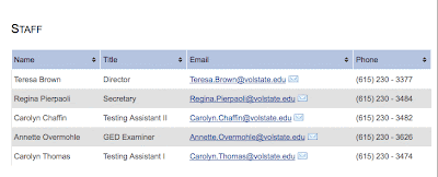
Making that change introduced a new problem. The easiest way for me to make this change is to add a column at the end of the table and move the email addresses there. But that puts the telephone numbers in the middle of the table. A mailto link is designed to be used online. A telephone number is non-interactive.
(Although I confirmed over the weekend that a Nexus One phone does recognize a well formed phone number on a web page and makes it behave a bit like a mailto link. Among our users that's an edge case and I have no confirmation of how other mobile devices treat phone numbers. [Several people have pointed out this is de facto standard behavior on smart phones.])
My gut tells me most people will either dial the number from the screen or write it down. Either will involve a bit of eye darting on and off the screen. Have you ever had to look away from one specific table cell and then locate it again quickly when you look back? Working in Excel can cause this just as much as tabular data on a website. It's not easy. I think putting the phone number at the end of the table helps with this a bit. This brings us to a 3rd iteration of a staff listing page.
Aesthetics vs. Usability
The list above shows a progression of what my gut tells me is increasing usability. However, my eye disagrees. Aesthetically I see each version as a step down from the previous. And without any real usability data I'm at a loss as to how to resolve this cognitive dissonance. I'm dealing with opinion either way. And since so much of the usability issue hinges on action taken off-line, picking up a phone and making a call, I can't think of a way to A/B test it.
I need to standardize these pages. Inconsistency kills both the usability and the aesthetics. All I've got to go by is my own conflicting opinions, so if you've got any ideas please share them.
Update
A strong preference for option #2 is already apparent among the people who have chimed in on this issue. Apparently I'm on to something with the email address as link text for mailto links but I'm probably over thinking the telephone number thing. I'm going to continue to mull this over mentally so feel free to continue to comment or email me if you're reading this now and have anything to share. But in the interest of productivity I'm going to make option #2 the standard format and get to work. :)


2 comments:
Derek, add a column BEFORE the name, put your email graphic there as a mailto link followed by the name, etc. ending with phone #.
Hey, you could also leave the viewing preference to the end user by creating a few different data layout stylesheets. Then either icons or a dropbox to choose. Similar to the "My Computers" pane at LogMeIn.com (Highly recommended FREE Remote Access for PC & MAC)
Post a Comment